- Health
Analysis of alleged Medicare data by Steve Kirsch is flawed and doesn’t show COVID-19 vaccines increase mortality rate
Key takeaway
Kirsch’s claim that COVID-19 vaccines increase a person’s risk of death is based on a flawed data analysis. The data used is of questionable provenance and carries significant limitations, such as uncertainty over how the analyzed dataset was selected and incomplete information on vaccination status. Published studies using more reliable sources of data that don’t carry the same limitations didn’t find that COVID-19 vaccination increases mortality rate.
Reviewed content
Verdict:
Claim:
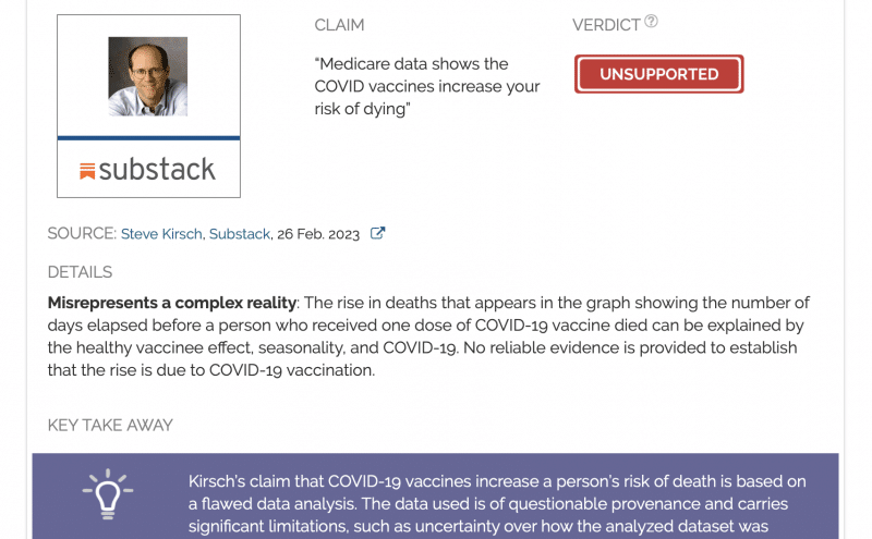
“Medicare data shows the COVID vaccines increase your risk of dying”
Verdict detail
Misrepresents a complex reality: The rise in deaths that appears in the graph showing the number of days elapsed before a person who received one dose of COVID-19 vaccine died can be explained by the healthy vaccinee effect, seasonality, and COVID-19. No reliable evidence is provided to establish that the rise is due to COVID-19 vaccination.
Full Claim
“Medicare data shows the COVID vaccines increase your risk of dying”; “It shows that these shots increase your risk of dying and once you get shot, your risk of dying remains elevated for an unknown amount of time. And that’s in the very population it is supposed to help the most!”; “If nobody can explain how the ‘slope goes the wrong way,’ then this should be GAME OVER for the vaccination program”
review
On 26 February 2023, entrepreneur Steve Kirsch published a Substack post with the headline “Medicare data shows the COVID vaccines increase your risk of dying”. Medicare is federal health insurance for people aged 65 and older in the U.S. According to Kirsch, this data was “hidden”, but had been mailed to him in a USB drive by an anonymous “whistleblower”. The post received more than 5,700 user engagements on Facebook, according to the social media analytics tool CrowdTangle. Kirsch’s tweet of the post drew more than 2,000 retweets.
In the post, he used this data to compare the trends in mortality of people who received the COVID-19 vaccine with that of weekly mortality trends in 2021 of both vaccinated and unvaccinated people.
He stated that if COVID-19 vaccines weren’t harming people, then the trends should look the same. But he observed that rather than showing the typical peak-trough-peak pattern that is the result of seasonal fluctuations in deaths, there was instead a spike in deaths, slightly after 300 days of receiving the first dose of COVID-19 vaccine. Kirsch interpreted this as evidence that the COVID-19 vaccines are harmful.
But this is a premature conclusion that isn’t supported by the analysis, as we will see below. It’s also not the first time Kirsch has made inaccurate or unsubstantiated claims about COVID-19 vaccine safety.
Furthermore, the authenticity of the data is in question. While Kirsch asserted that the data were authentic, as it matched with records he already had, we don’t have a way to independently verify this claim, since the data isn’t public. On top of this, Kirsch stated in the spreadsheet of his data that it doesn’t capture all deaths following vaccination and that it is “a random subset”. Whether it is actually a randomized selection of Medicare data is, again, unknown.
Health Feedback reached out to the Centers for Medicare & Medicaid Services (CMS) for comment. In an email, a spokesperson stated that “CMS does not have data that would support the claims of this blog post”.
Overall, readers are advised to interpret Kirsch’s analysis with due caution.
Potential causes of death like COVID-19 aren’t fully accounted for in Kirsch’s analysis
Kirsch’s comparison of mortality trends is based on our knowledge of seasonal fluctuations in deaths[1,2]. Deaths tend to peak in winter months, then fall towards summer. This pattern tends to be more pronounced in older populations, which is relevant to Kirsch’s dataset as it includes those aged 65 and above. If we were to plot all-cause mortality in this age group on an annual basis, we would expect to see a graph with a peak-trough-peak pattern in one year, shown below in Figure 1.
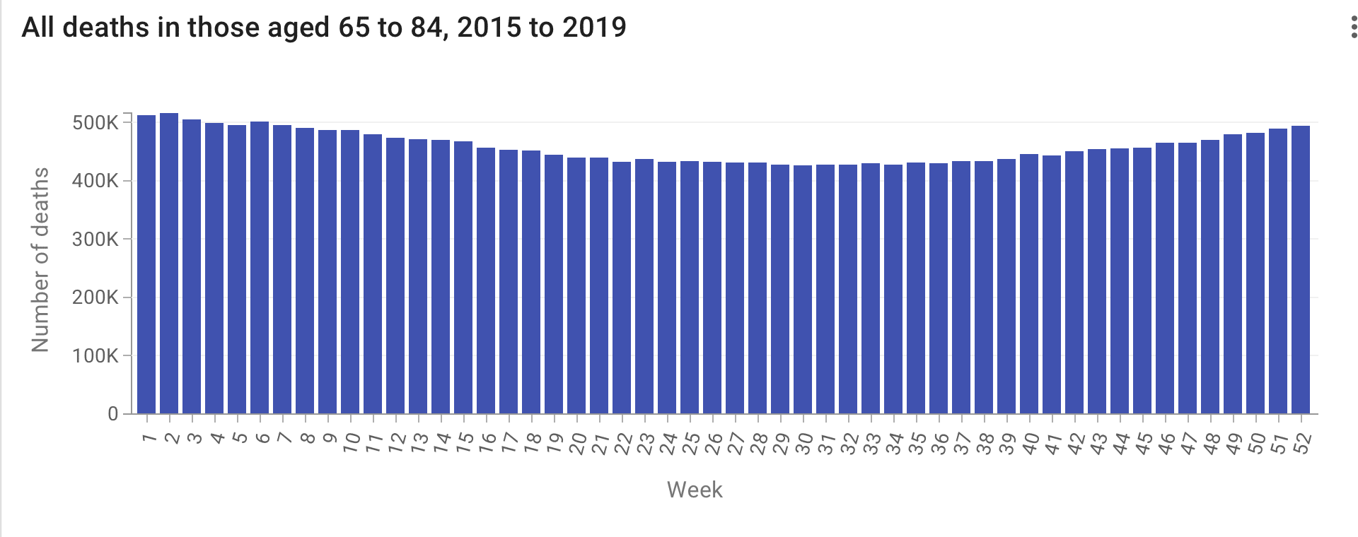
Figure 1. Sum of all deaths in those aged 65 to 84 from 2015 to 2019. Source: U.S. National Center for Health Statistics (Weekly Counts of Deaths by Jurisdiction and Age). Data retrieved on 6 March 2023.
In order to analyze mortality trends in vaccinated people, Kirsch chose to measure how many days passed before someone who received their first dose of COVID-19 vaccine died. This measure of “days until death from shot #1”, as Kirsch put it, forms the cornerstone of his analysis.
His analysis began with people who’d received the first dose in the first quarter of 2021, under the assumption that most people aged 65 and above had received their first dose during this period. Data from the U.S. Centers for Disease Control and Prevention (CDC)’s data regarding COVID-19 vaccination trends by age does support this, showing that the majority of the U.S. population aged 65 and above received their first dose within the first quarter of 2021 (Figure 2), although it wasn’t until August 2021 when 90% of this population received their first dose.
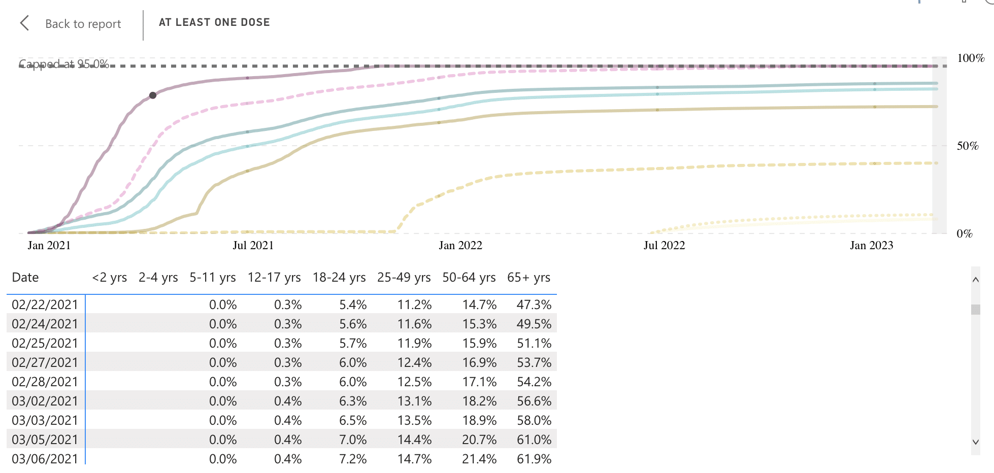
Figure 2. The proportion of people in each age group that received at least one dose of COVID-19 vaccine. Almost half of the population aged 65 and above (49.5%) received their first dose by 24 February 2021. Source: CDC COVID Data Tracker (Vaccination Trends by Age and Sex). Data retrieved on 6 March 2023.
Figure 3 below shows a screenshot of the first “days until death from shot #1” graph presented by Kirsch, showing that deaths rose and spiked about more than 300 days after the first vaccine dose. This appeared to buck the peak-trough-peak pattern shown in the graph of weekly deaths, which Kirsch interpreted as evidence that the COVID-19 vaccines increased a person’s risk of death since according to him, this couldn’t be explained by seasonality.
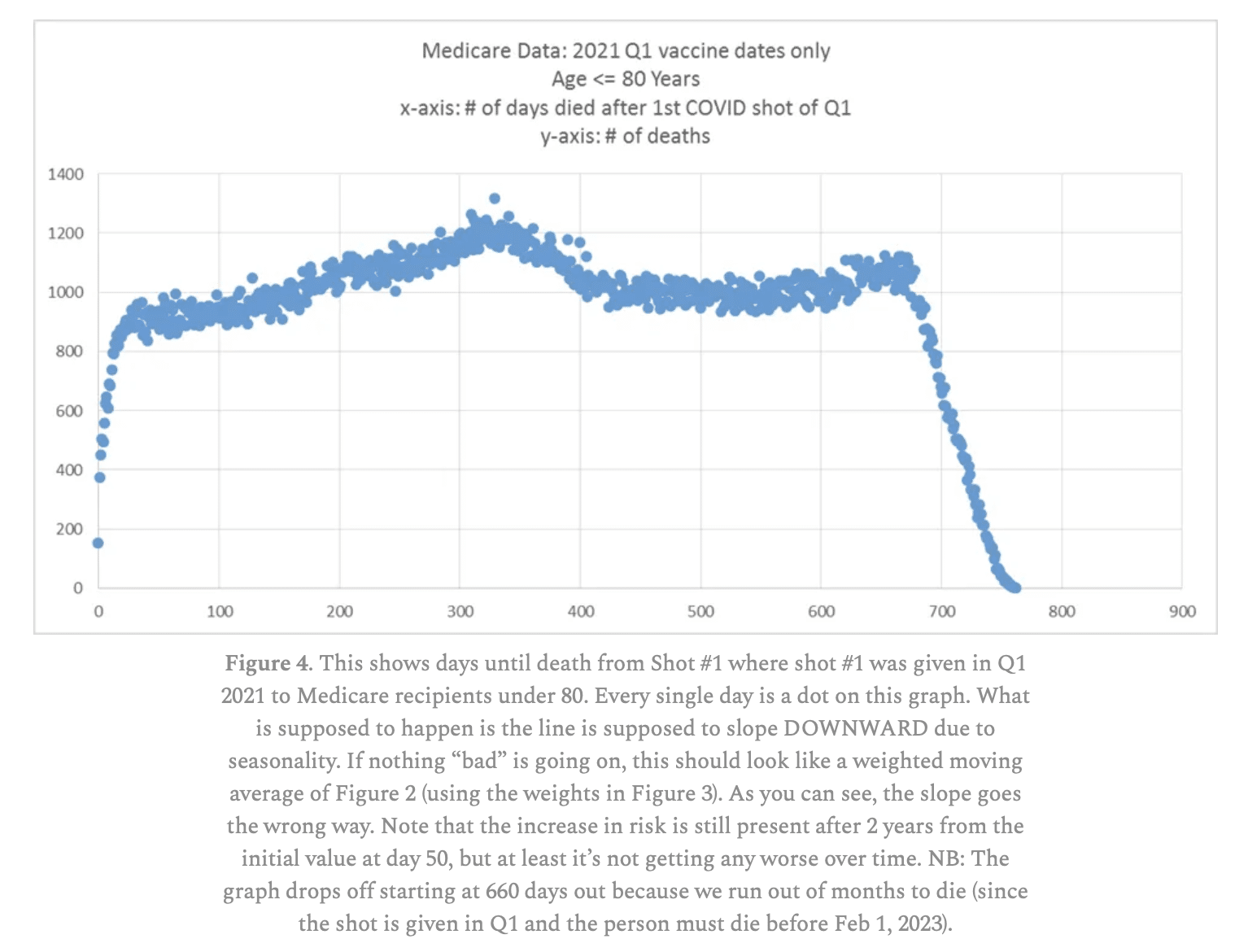
Figure 3. A screenshot of Kirsch’s post, showing the first “days until death from shot #1” graph that he presented. The graph includes only individuals who received their first dose in the first quarter of 2021, thus it can be reasoned that the beginning of the time period measured in this graph roughly corresponds to the beginning of 2021.
However, interpreting these graphs requires keeping several things in mind. Firstly, there is always a baseline rate of death occurring in every population, and even unvaccinated people die of various causes.
Kirsch’s post provided no reliable control group to compare the vaccinated group to. While he did offer a graph of deaths in people with no record of COVID-19 vaccination as a control group, the fact is—as Kirsch himself acknowledged—having no record of COVID-19 vaccination in Medicare doesn’t mean the person is actually unvaccinated. This is because Medicare beneficiaries can receive the COVID-19 vaccine at a variety of sites, not all of which generate a claim in Medicare.
As such, there is no meaningful way to reliably capture mortality outcomes in vaccinated people or to compare trends with unvaccinated people, since we don’t know for sure based on Kirsch’s data whether people are actually unvaccinated. Without a reliable baseline as comparison, it’s impossible to draw conclusions about whether the risk of death in the vaccinated group is higher or lower than expected.
Secondly, all things being equal, a population that is larger in size will have more deaths than a smaller population, even though both populations have the same mortality rate. Kirsch’s graphs only use absolute numbers of deaths, rather than the mortality rate for the population (such as deaths per 100,000). No information is available on the size of the populations included in Kirsch’s dataset, whether it is for the vaccinated people or those with no record of vaccination. This is yet another obstacle to ensuring that graphs of different populations are comparable.
Thirdly, the sharp rise in the number of deaths shortly after vaccination can be attributed to the healthy vaccinee effect, as Jeffrey Morris, a biostatistician and professor at the University of Pennsylvania pointed out on Twitter. This can happen because people who are severely ill or close to death are very unlikely to receive the COVID-19 vaccine. Therefore, such deaths wouldn’t be recorded in Kirsch’s dataset, and there are very few deaths recorded in the early days post-vaccination (see Figure 3) until a baseline mortality rate establishes itself again over time.
Fourthly, the peak in deaths takes place roughly past 300 days following the first dose. This would actually place that peak sometime around December 2021 and January 2022, since the majority of Medicare beneficiaries received at least one dose of COVID-19 vaccine in the first quarter of 2021.
And as Kirsch’s own graphs on weekly deaths illustrated, the period around December 2021 and January 2022 corresponds to the yearly peak that occurs due to seasonal fluctuations. Therefore, the pattern observed by Kirsch can simply be explained by seasonality. In other words, the problem here with comparing the “days until death from shot #1” graphs to that of weekly deaths like in Figure 1 is that the dimension of time is being measured differently: one measures time in days, the other in weeks.
Health Feedback also reached out to epidemiologist Katelyn Jetelina, who questioned whether Kirsch had accounted for different waves of COVID-19 in 2021. The Centers for Medicare & Medicaid Services doesn’t collect data on cause of death, but the CDC’s epidemiological data for the whole of the U.S., shown in the COVID Data Tracker, shows that the same period also corresponds to a wave of COVID-19 cases and deaths in the U.S. (Figure 4).
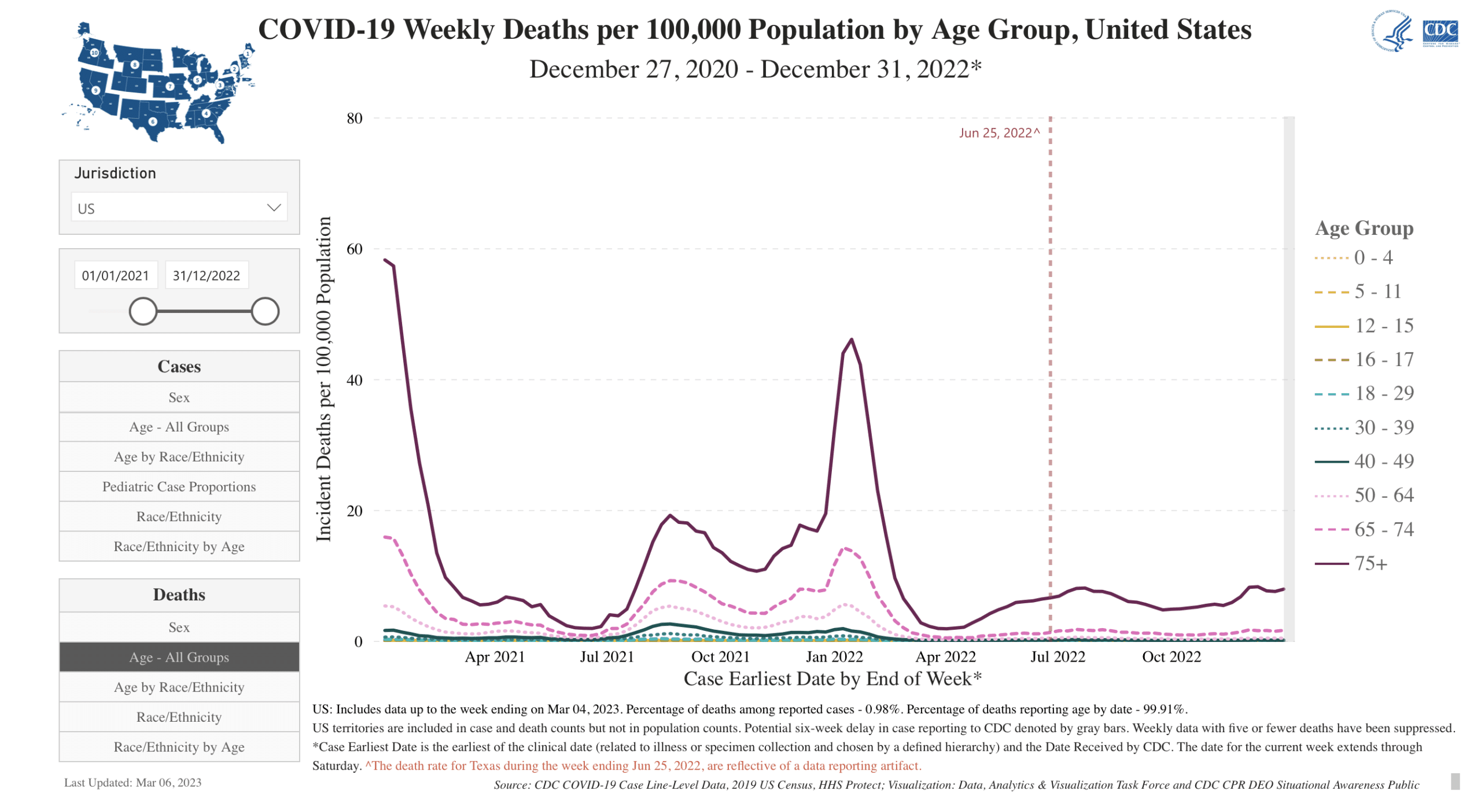
Figure 4. Weekly COVID-19 deaths per 100,000 people, by age group. Source: CDC COVID Data Tracker. Data retrieved on 7 March 2023.
In addition, most Medicare beneficiaries are aged 65 and above. As the breakdown of COVID-19 deaths by age group shows, the largest proportion of COVID-19 deaths during this time can be traced to this age group. Therefore, the spike in deaths that Kirsch observed is likely the result, at least in part, of disproportionately higher COVID-19 deaths in this age group.
Kirsch’s graph of “days until death” in people who received the first dose in the second quarter of 2021 (as opposed to the first quarter) only further supports both the above explanations—we see that the spike in deaths is brought forward in time, before 300 days (compare Figure 5 below with Figure 3). Because the time period measured in the graph starts later, both seasonal deaths and COVID-19 deaths would make their appearance earlier.
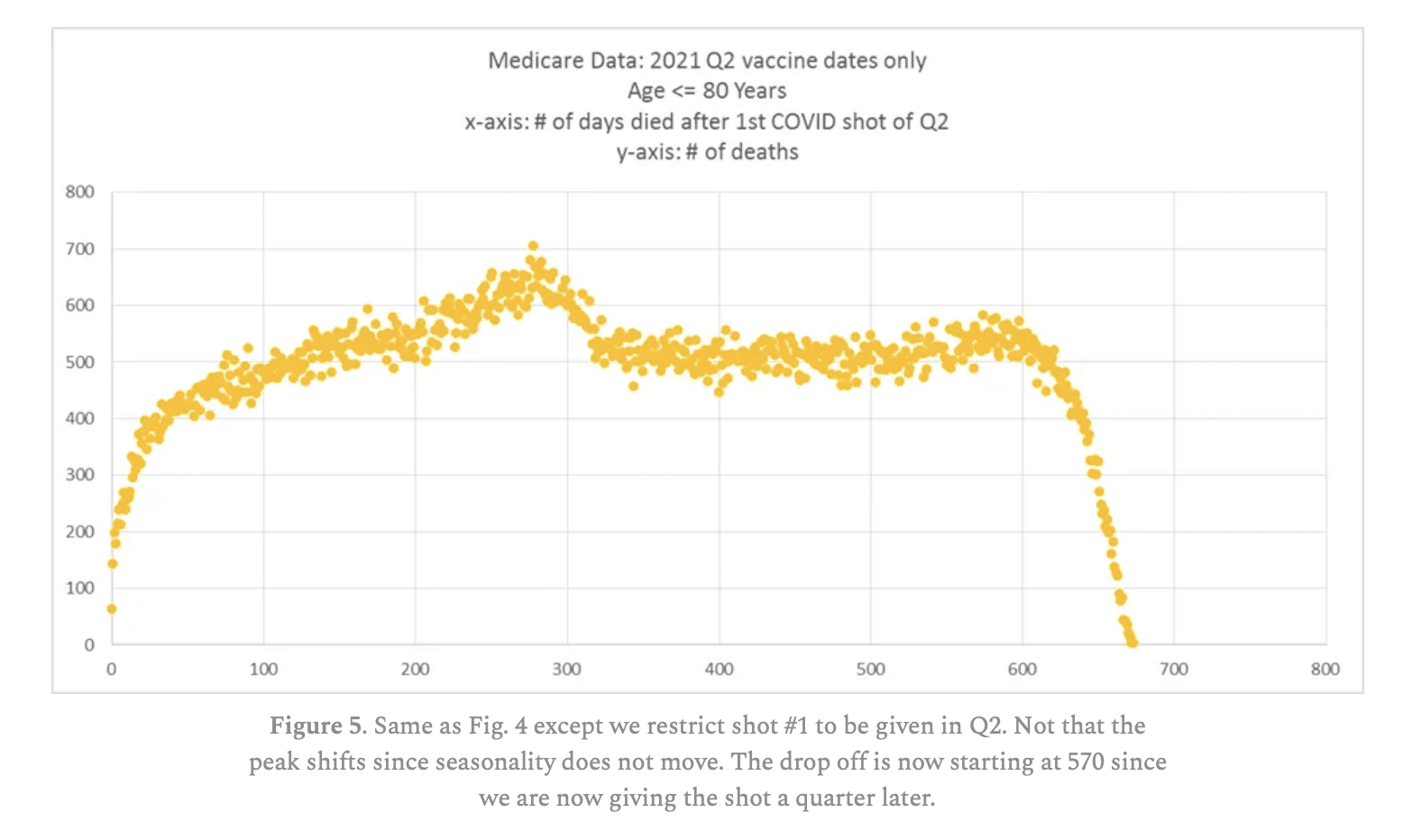
Figure 5. Screenshot of Kirsch’s graph depicting the number of days elapsed before a person who had received the first dose of COVID-19 vaccine in the second quarter died. Note that the peak in deaths occurs earlier than in the graph of first-quarter first-dose recipients.
Curiously, Kirsch also plotted a graph of weekly deaths in people aged 65 and above in 2021, which he used to represent what would happen if the vaccine was safe (Figure 6). This is inconsistent with his claim that COVID-19 vaccines are increasing mortality rates, since the majority of people in this age group received the first dose of vaccine very early on in the year, which the post itself acknowledged. If his claim were true, we would expect the increased mortality rate to have made itself apparent in 2021, bucking the expected trend, so this wouldn’t plausibly function as a “control group”.
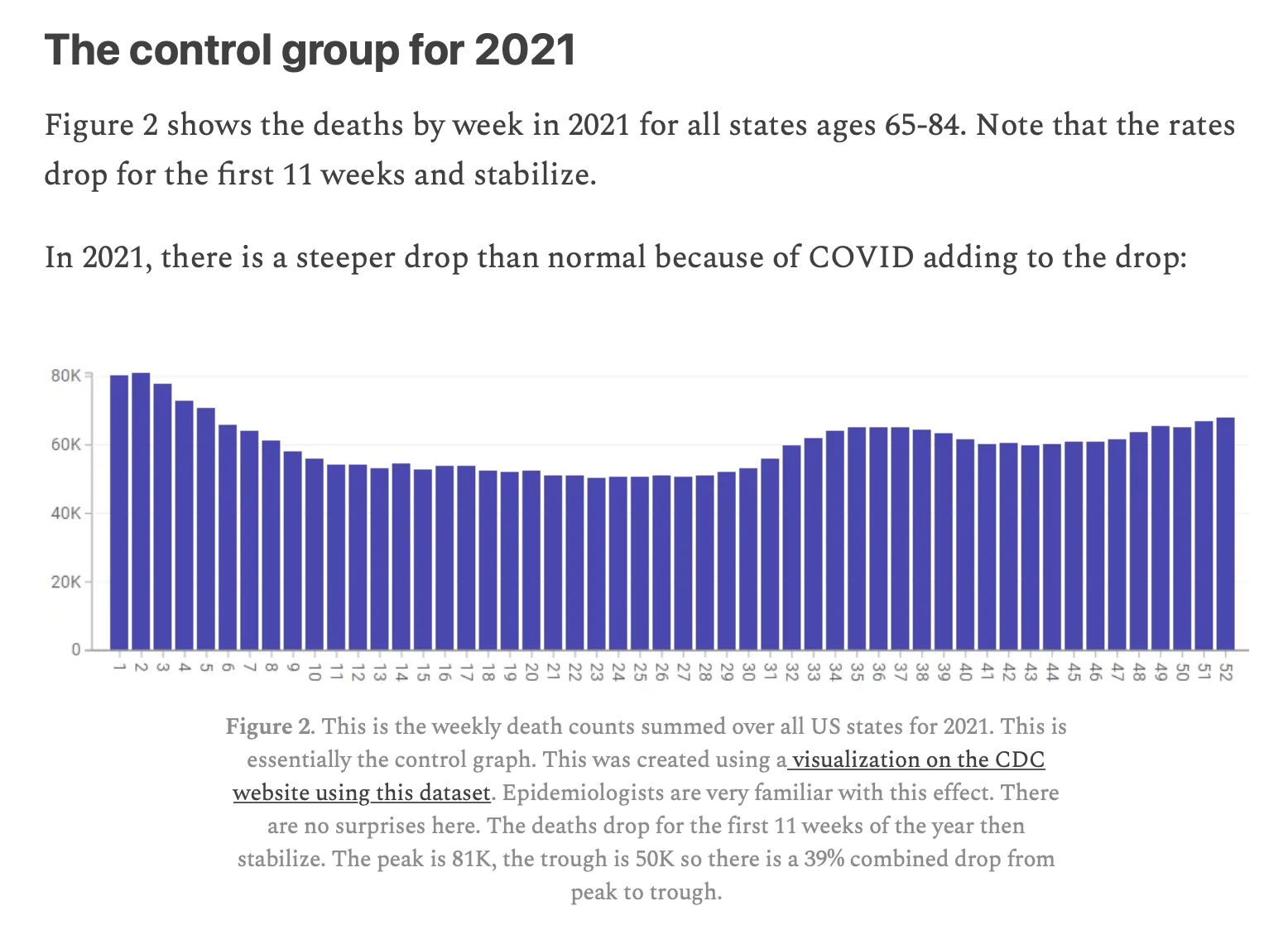
Figure 6. Screenshot of Kirsch’s post, showing a graph of all weekly deaths in the U.S. for the population aged 65 to 84 in 2021, which Kirsch considered the “control group” that represents what happens with a “safe vaccine”.
Health Feedback reached out to Kirsch for comment, but didn’t receive a response by the time of publication.
Published studies show that COVID-19 vaccines don’t increase a person’s risk of death
Studies haven’t found that vaccinated people are more likely to die compared to unvaccinated people. One such example is a CDC study examining the period between December 2020 and July 2021[3], which found that COVID-19 vaccine recipients had lower rates of non–COVID-19 mortality.
Another study, published in the journal JAMA Network, looked at excess mortality in the U.S. and other peer countries between June 2021 and March 2022. It reported that excess all-cause mortality was greater in the ten least-vaccinated states than in the ten most-vaccinated states[4].
Another study in the state of Indiana, which included more than 520,000 people, compared vaccinated people with unvaccinated, previously infected people. The study found that all-cause mortality was 37% lower in the vaccinated group[5].
Conclusion
Kirsch’s claim that COVID-19 vaccines increase a person’s risk of death is based on an unreliable data analysis. The data used is of questionable provenance and carries significant limitations, such as uncertainty over how the dataset was selected and incomplete information on vaccination status. The analysis also doesn’t contain sufficient information to determine and compare mortality rates, as population sizes are unknown. The rise in deaths recorded in Kirsch’s graphs can be explained by the healthy vaccinee effect, seasonality, and COVID-19. Published studies using more reliable sources of data and methods didn’t find that COVID-19 vaccination increases mortality rate.
REFERENCES
- 1 – Parks et al. (2018) National and regional seasonal dynamics of all-cause and cause-specific mortality in the USA from 1980 to 2016. eLife.
- 2 – Fowler et al. (2014) Excess Winter Deaths in Europe: a multi-country descriptive analysis. European Journal of Public Health.
- 3 – Xu et al. (2021) COVID-19 Vaccination and Non–COVID-19 Mortality Risk — Seven Integrated Health Care Organizations, United States, December 14, 2020–July 31, 2021. Morbidity and Mortality Weekly Report.
- 4 – Bilinski et al. (2023) COVID-19 and Excess All-Cause Mortality in the US and 20 Comparison Countries, June 2021-March 2022. JAMA Network.
- 5 – Tu et al. (2023) SARS-CoV-2 Infection, Hospitalization, and Death in Vaccinated and Infected Individuals by Age Groups in Indiana, 2021‒2022. American Journal of Public Health.

